- Solan Sync
- Posts
- Explore the Top Custom GPT Models for Data Science in 2024
Explore the Top Custom GPT Models for Data Science in 2024
In the ever-changing landscape of data science, the year 2024 has unveiled custom GPT models that are setting new standards for efficiency and innovation.
Solan Sync
February 22, 2024

In the ever-changing landscape of data science, the year 2024 has unveiled custom GPT models that are setting new standards for efficiency and innovation.
Join me as we delve into the newest breakthroughs, highlighting how these innovative tools are revolutionizing data analysis, forecasting, and more.
Investigating and Analyzing Data
This is the link: https://chat.openai.com/g/g-szLI1DTZn-data-visualization-expert
This is the dataset we are going to use today for FREE: https://www.kaggle.com/datasets/krishd123/olympics-legacy-1896-2020?resource=download
After loading our data to this GPT, with the following prompt:
Generate a scatter plot for this datasetWonderful, now it decides of the data to do data visualization. Let’s see the visuals.
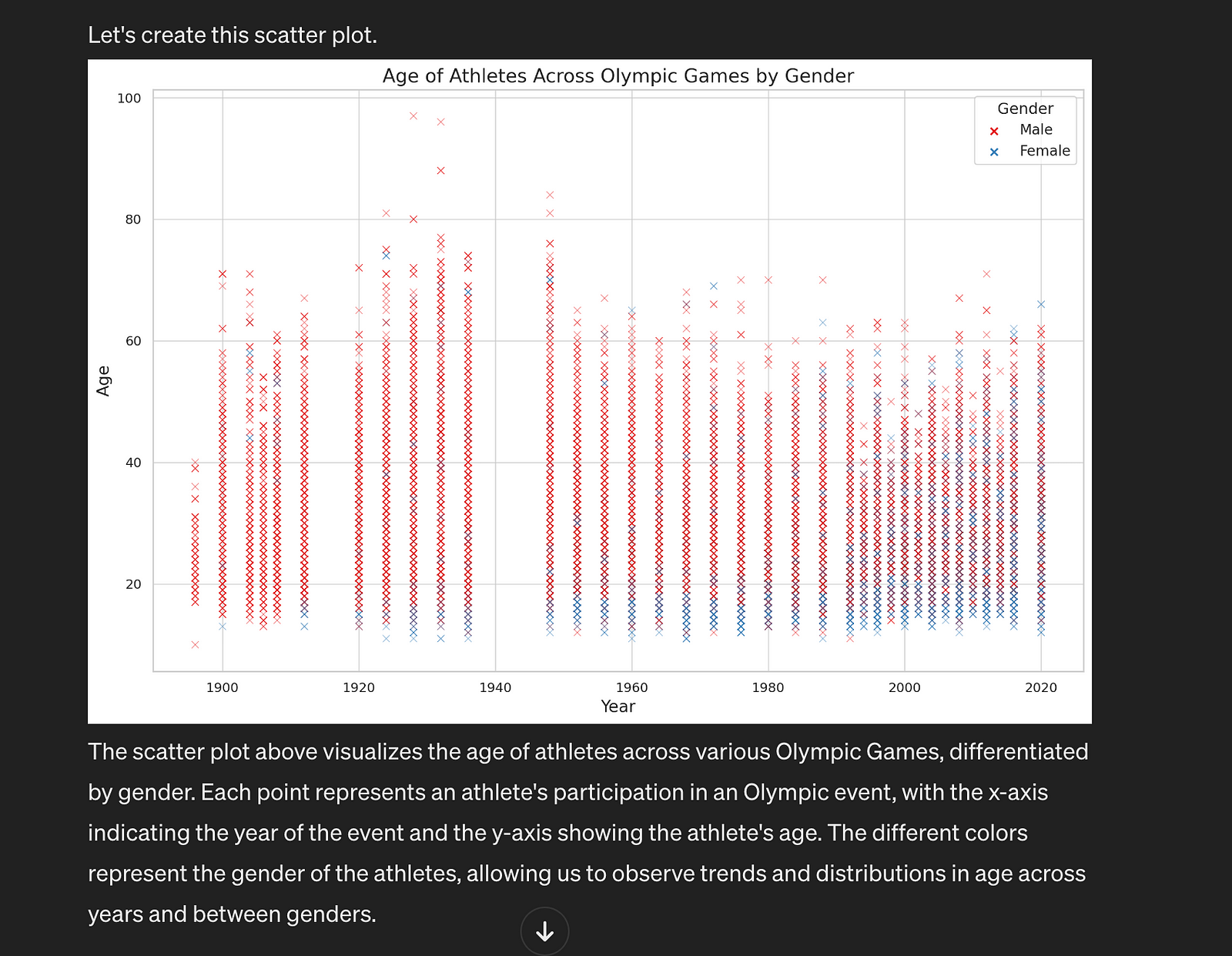
Can you surprise me?ChatGPT replys;
Let’s explore a different aspect of the dataset that could reveal interesting insights. How about we look at the distribution of medals across different sports, highlighting the top sports with the most medals awarded? This will allow us to see which sports contribute the most to the medal tally and may uncover some surprising trends.
I’ll create a visualization that shows the top 10 sports by total medals awarded, using a bar chart to display this information. This should offer a clear view of which sports dominate the Olympic Games in terms of medals.
Let’s create this visualization.
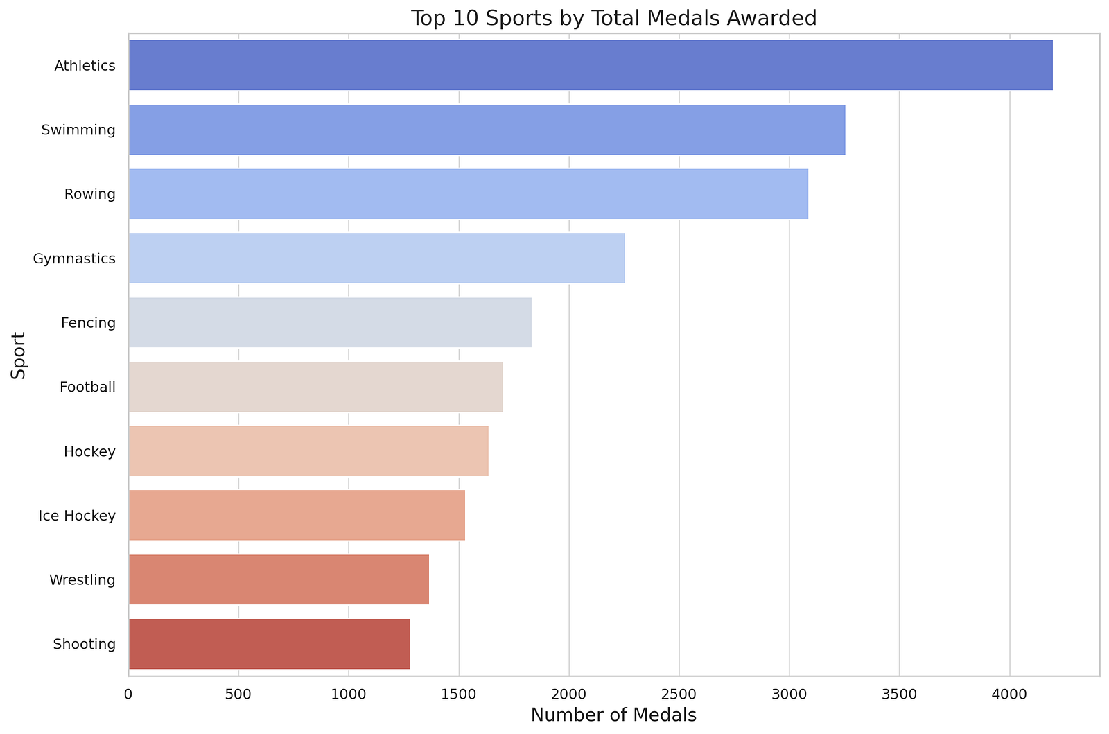
The bar chart above displays the top 10 sports by the total number of medals awarded in the Olympic Games. This visualization provides a clear view of which sports have historically been the most successful in terms of medals.
This kind of analysis can reveal the sports that attract the most competition and success, potentially due to their popularity, accessibility, or investment in training and development across different countries.
Awesome!
Can you surprise me even more?
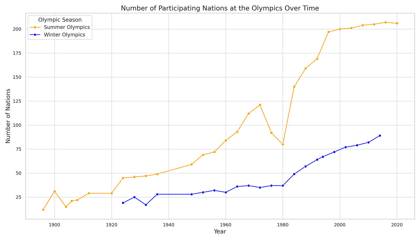
Let’s delve into an exploration of the diversity of the Olympic Games by visualizing the number of participating nations over the years. This will provide insight into the global expansion and inclusivity of the Games, highlighting how the event has grown to bring together countries from around the world.
We’ll create a line chart to track the number of unique National Olympic Committees (NOCs) that have participated in each Olympic year. This visualization will not only show the growth in the number of participating nations but also reflect historical moments where geopolitical events might have influenced participation.
Let’s proceed with this analysis.
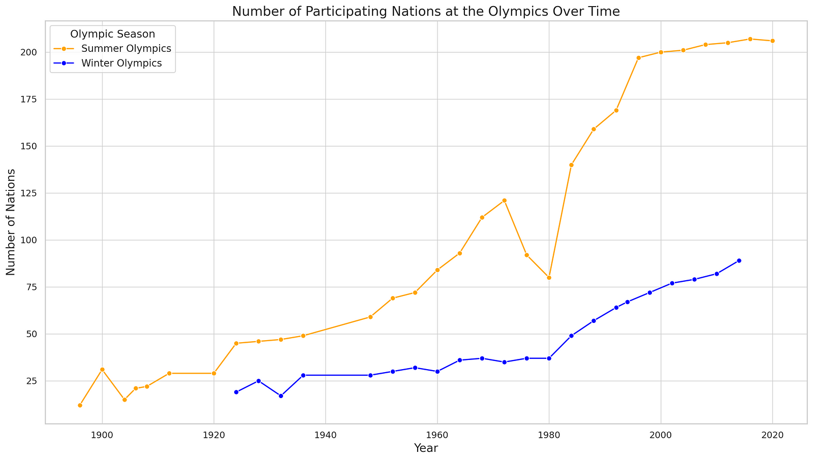
The line chart above illustrates the number of participating nations at both the Summer and Winter Olympic Games over time. This visualization highlights the growth in global participation, showing how the Olympics have expanded to include a more diverse array of countries.
Key observations might include significant jumps in participation, which could correlate with historical events or changes in IOC policies, as well as the difference in scale between the Summer and Winter Games.
This analysis underscores the Olympics’ role in fostering international unity and competition, showcasing the event’s evolution into a global platform for athletes from a wide range of nations.
If you’re curious about another aspect of the Olympic Games or have a different dataset in mind for exploration, feel free to share!
# Group the data by Year and Season, then count the unique NOCs
participation_by_year = df.groupby(['Year', 'Season'])['NOC'].nunique().reset_index()

# Since the dataset might include both Summer and Winter Olympics, let's create separate lines for each
participation_summer = participation_by_year[participation_by_year['Season'] == 'Summer']
participation_winter = participation_by_year[participation_by_year['Season'] == 'Winter']

# Create a line chart
plt.figure(figsize=(14, 8))
sns.lineplot(data=participation_summer, x='Year', y='NOC', marker='o', label='Summer Olympics', color='orange')
sns.lineplot(data=participation_winter, x='Year', y='NOC', marker='o', label='Winter Olympics', color='blue')

# Enhancing the plot
plt.title('Number of Participating Nations at the Olympics Over Time', fontsize=16)
plt.xlabel('Year', fontsize=14)
plt.ylabel('Number of Nations', fontsize=14)
plt.legend(title='Olympic Season', title_fontsize='13', fontsize='12')

# Show plot
plt.tight_layout()
plt.show()
Thank you for reading this article so far, you can also get the free prompts from here.
Also, Discover the best AI tools with us below.
What Will You Get?
Access to my Premium Prompts Library.
Access our News Letters to get help along your journey.
Access to our Upcoming Premium Tools for free.
Check out discounted digital contents on https://www.solan-ai.com/
Subscribe Our FREE NewsLetter now!
Bonus
The Notion page showcases its platform designed for creating wikis, documents, and managing projects. It features an AI assistant, various templates, and is suitable for teams of all sizes. The platform caters to diverse professional groups and emphasizes community engagement and global events. For more details, you can visit their Notion page
Reply